
How to Mislead With Statistics: A Crash Course
May 26, 2020
We are bombarded with information through charts and graphs every day. These facts and statistics are supposed to be cold, hard, unbiased pieces of data. However, with a few creative adjustments, it is easy to make a chart or graph that, while providing technically correct data, is incredibly misleading for people who don’t take the time to carefully analyze it. Consider the following examples.
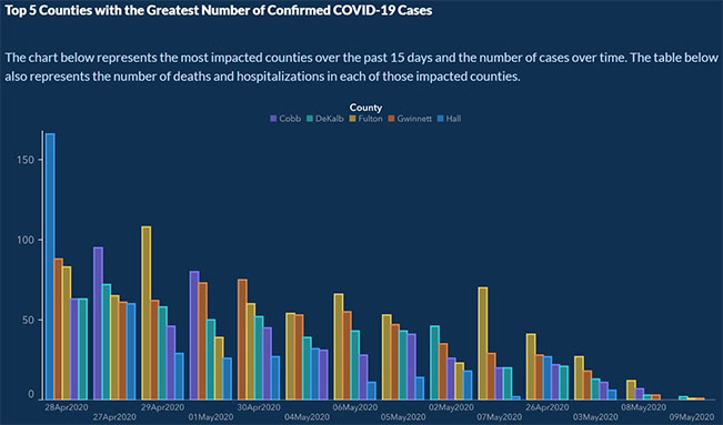
In May 2020, the Georgia Department of Public Health released the following chart of how the number of coronavirus cases changed over time in 5 major counties.
This chart appears to show a steady decline in cases from April 28th to May 9th. But this graph misrepresents the real trend. Each individual data point may be accurate, but the order in which those points are displayed was manipulated. April 28th is followed by April 27th, followed by the 29th, then May 1st, then April 30th, then May 4th. Furthermore, the counties are in a different order, sorted from highest to lowest for each date, so the eye is tricked into seeing a constant downward curve. Consider, for example, Fulton county (represented in yellow). The number of cases in Fulton actually increased four days in a row, from April 26th (11th date shown out of 14) through April 29th (3rd date out of 14).
A second example of how statistics can be misleading is the following graph showing the number of Americans who received some form of Federal welfare between 2009 and 2011.

This graph appears at first glance to show an increase in people receiving welfare of almost 300% from 2009 to 2011 based on the height of the bars! Closer inspection reveals that the y-axis is actually zoomed in, ranging only from 94,000,000 to 108,000,000. On a graph from 0 to 108,000,000, the increase would be negligible. Another issue is that the graph presents the number of Americans without accounting for the fact that the overall size of the population also increased during this time. Adjusting for population growth, there was only a real increase of less than 10% over those two years. Per capita statistics often present a more realistic picture than simple counts do.
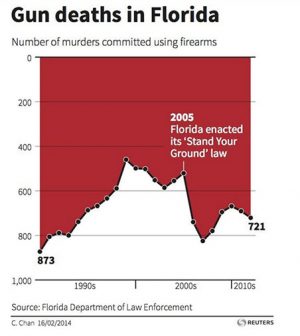
Finally, consider this graph, showing the number of firearm-related deaths in Florida after the enactment of the “Stand Your Ground” law, which allowed citizens to use firearms in self-defense.
This graph appears to show a stark decline in gun-related deaths immediately after the enactment of the “Stand Your Ground” law. It would be easy to look at this graph, conclude that the law was good and effective, and move on. However, the y-axis is inverted: 0 is at the top of the y-axis, and 1,000 is at the bottom: the polar opposite of how such graphs are usually constructed. When the graph is reflected to its proper orientation, it shows the exact opposite of the original conclusion–a stark increase in gun-related deaths immediately after the enactment of the “Stand Your Ground” law.
In our modern information age, we often do not take the time to carefully analyze every graph or statistic we see; rather we quickly glance at it and draw a conclusion. However, spending a little extra time to consider the details can help us understand the data better and avoid misinterpreting the data or drawing a false conclusion. Remember to check the axes of charts to ensure that the units are even and in the correct order. Furthermore, remember that absolute numbers can show trends and patterns that do not exist in per capita statistics. Even though the raw data you see is probably correct, it can easily be misrepresented by someone who is trying to have the data tell a particular story. Next time you see a graph, take a closer look. Even though data does not lie, it can tell a false story.